We use cookies and other tracking technologies to improve your browsing experience on our website, to show you personalized content and targeted ads, to analyze our website traffic, and to understand where our visitors are coming from.
From Four Wheels to Two (or less?)
A data-driven analysis of how I’ve started driving less and walking/biking more since I moved to DC in 2023!
In June of last year, I finally crossed the Potomac river and made the move to Washington, D.C. with my partner. One of the major questions I had going into the move was: “am I going to need my car?”
This question may seem surprising to ask when moving to an American city. After all, most American cities are just a series of stroads and poor pedestrian/bike infrastructure that almost certainly require a car to navigate. But Washington D.C. has been a significant change from the places I’ve lived before, certainly better than:
Amherst, VA – where “wtf is public transit?” was probably not an unheard of question.
Salem, VA – where I first got a taste of having (mostly) everything accessible within walking distance, but where I still chose my car to get most places.
Herndon, VA – where I spent the first few months of the pandemic locked away! Still pretty far out, though I could drive to the metro station!
My first real experience of being able to bike or walk places rather than taking my car was in Alexandria, VA. With a metro stop in walking distance, a bike network that could take me west down Eisenhower Avenue or north to Georgetown, and the ability to get to Old Town Alexandria by walking or taking a bike share, this was my first real taste of a life where I didn’t need to rely on my car to get places.
The most significant change for me was when I moved to Ballston, in Arlington, VA. My partner lived a 10 minute bike ride away, I could easily ride to the Harris Teeter down the street and bike back with groceries, and the trail network was absolutely amazing and easily accessible. I frequently would hit the Bluemont Trail from my building, connect with the Washington and Old Dominion trail, and make my way to Four Mile Run where I could fish.
From all of this (and after being orange-pilled by Not Just Bikes), I started wondering…do I even need my car? Do I even like driving?
A Data-Driven Analysis of My Transportation Habits
Getting the Data & Setup
I decided it would be fun to find some hard data to back what I’ve been feeling, which is that I’ve used my car significantly less since moving to DC and that I’ve used my feet and my bike far more.
I got this data from Google Maps, which you can do as well if you go to the “Download your Maps data” section here.
Note
I understand Google Maps is a bit of a privacy nightmare if you hate the idea of a giant corporation knowing your travel history and everywhere you go…but it definitely is a great data source for a project like this! 😄
The data is provided as a series of JSON files for each month of each year of history. To parse this, I used R and wrote a series of helper functions.
Basically, these functions determine the set of files for a year, then from those files extract the mode of transit for the activity (or at least what Google Maps thinks it was!) and the date of the activity, then parses them into a single DataFrame that we can use for analysis. The libraries I used and the helper functions are below, they rely particularly on purrr.
Once those are set up, getting the files is pretty clean/easy! And the output is a simple DataFrame that we can build from.
Code
## get the data ----main_folder <-"~/Downloads/Takeout/Location History (Timeline)/Semantic Location History/"data_years <-2019:2024all_files <- data_years |>map(~sprintf(paste(main_folder, "%s", sep =""), .x ) |>list.files() )names(all_files) <-paste("y", 2019:2024, sep ="")all_trips <-2019:2024|>map_dfr(~get_files_by_year(all_files, .x) |>parse_to_df() )head(all_trips, 10)
# A tibble: 10 × 4
   activity_timestamp       activity_date activity_type         transit_mode
   <chr>                    <date>        <chr>                 <chr>
 1 2019-12-22T18:53:30.005Z 2019-12-22    IN_PASSENGER_VEHICLE  Car
 2 2019-12-22T23:56:39.410Z 2019-12-22    IN_PASSENGER_VEHICLE  Car
 3 2019-12-23T00:50:17Z     2019-12-23    IN_PASSENGER_VEHICLE  Car
 4 2019-12-23T01:00:02.009Z 2019-12-23    UNKNOWN_ACTIVITY_TYPE <NA>
 5 2019-12-23T15:57:39.630Z 2019-12-23    IN_PASSENGER_VEHICLE  Car
 6 2019-12-23T22:56:15.999Z 2019-12-23    IN_PASSENGER_VEHICLE  Car
 7 2019-12-24T17:34:32.141Z 2019-12-24    IN_PASSENGER_VEHICLE  Car
 8 2019-12-24T18:54:12.272Z 2019-12-24    IN_PASSENGER_VEHICLE  Car
 9 2019-12-24T22:33:43.414Z 2019-12-24    IN_PASSENGER_VEHICLE  Car
10 2019-12-25T17:28:11.251Z 2019-12-25    IN_PASSENGER_VEHICLE  Car
I’ll note that there’s plenty of other information you can extract from the JSON files that Google provides, but I was mostly interested in the raw number of trips taken. You could also reasonably extract the distance and other information too.
Now, let’s take a look at the data!
Examining the Overall Trend
The chart below shows the overall trend of my transit activity by mode from 2020-2024 by month.
Code
all_trips |>filter(year(activity_date) >=2020) |>mutate(trip_month =floor_date(activity_date, unit ="month") ) |>group_by(transit_mode, trip_month) |>summarize(n =n(), .groups ="drop_last") |>arrange(trip_month) |>mutate(cumulative_trips =cumsum(n)) |>ungroup() |>filter( transit_mode %in%c("Car", "Biking", "Walking", "Public Transit"), year(trip_month) >=2021 ) |>ggplot() +aes(x = trip_month, y = n, color = transit_mode ) +geom_smooth(se = F, linetype ="dashed", color ="darkgrey", linewidth = .75) +geom_line(linewidth = .75) +theme_minimal() +geom_vline(xintercept =date("2023-06-17") ) +facet_wrap(~transit_mode) +labs(x =NULL, y ="Number of Trips", title ="Trips by Month, 2020-2024", caption ="\nvertical line represents the date we moved to DC" ) +theme(panel.grid.major =element_blank(), text =element_text(family ="IBM Plex Sans"),plot.title =element_text(size =14, face ="bold"), legend.position ="none", plot.caption =element_text(face ="italic") ) +scale_color_manual(values =c("#201658", "#1D24CA", "#98ABEE", "#E8C872"))
Overall, the number of trips I’ve taken by car has decreased quite a bit since moving to DC–which is what I expected. If I excluded my trip home in December (where car travel is basically the only option), I imagine this trend would be even more pronounced.
An interesting observation here is that the number of trips I’ve taken using public transit has stayed relatively flat in comparison to the other methods of transportation. It’s still increasing slightly (see below), but not as fast as other modes of transportation.
That’s not particularly surprising to me–the DC Metro is not really intended to be an inter-city transportation option, but serves primarily as a commuter rail system for those outside of the city to get in and out. Now that we live in the city, we just aren’t taking metro as much (though we do take the bus sometimes!).
Here’s a full YoY comparison of my trips biking, in a car, on public transit, or walking.
I bought a bike in ’21, hence the massive YoY increase in 20-21.
From 2022 to 2023, I’ve reduced the total number of trips I’ve taken by car by at least 28%. Comparing the period of June through December of 2023 and 2022, the number of trips taken by car has decreased 56%. That’s a pretty significant drop either way!
Examining Trips on a Cumulative Basis (Jan 2023 - Now)
I was also interested in determining the rate at which the total number of trips I’ve taken by car has increased since moving. The methodology is: using the cumulative number of trips taken by car in June of 2023 as a baseline, at what rate has that increased for car trips versus other modes of transit?
Based on the chart below, the overall total number of trips taken by car (since Jan 2023) has increased at a rate of 29% since we moved in June. But the number of trips taken by walking has increased at a rate of 280%! And the total by bike has increased at a rate of 191%!
Code
trips_w_cumulative_measure |>filter(transit_mode %in%c("Car", "Biking", "Walking", "Public Transit")) |>ggplot() +aes(x = trip_month, y = cumulative_trips, color = forcats::fct_relevel(transit_mode, c("Car", "Walking", "Biking", "Public Transit")) ) +geom_line(linewidth = .75) +theme_minimal() +geom_vline(xintercept =date("2023-06-17"), linetype ="dashed" ) +geom_text(aes(x =date("2023-06-17"), y =241), label ="Moved to DC", color ="black", check_overlap = T, angle =90, vjust =-.5, hjust = .005, size =3.5 ) +geom_text(data = change, aes(label =paste("+", scales::percent(percent_change), "*", sep ="")),hjust =-.15, size =3.5, show.legend = F, family ="IBM Plex Sans" ) +labs(x =NULL, y ="Total Cumulative Trips", title ="Total Trips by Transit Mode, Jan 2023-Feb 2024",color =NULL, caption ="\n* % increase since move to DC in June 2023" ) +scale_x_date(limits =c(date("2023-01-01"), date("2024-03-10")), date_breaks ="3 month",date_labels ="%b-%Y" ) +theme(panel.grid.major =element_blank(), text =element_text(family ="IBM Plex Sans"),plot.title =element_text(size =14, face ="bold") ) +scale_color_manual(values = TRANSIT_COLOR_VALUES )
What I’d ideally like to see in this chart going forward is a continued flattening of the cumulative car trips taken since January of 2023. Maybe some day, that line will grow at a 0% rate 😊
What About DC Makes this Possible?
Generally speaking, there are a few reasons I can think of that account for these numbers.
density
non-car infrastructure
accessible, mostly reliable transit
We live around the Logan Circle neighborhood, and just via walking have access to a lot. 14th street is full of shops and restaurants, and if we go the opposite direction there are a number of restaurants and shops further into Shaw as well. Additionally, we have easy access to Giant, Whole Foods, or Trader Joe’s for groceries. For longer trips, there is easy metro or bus access.
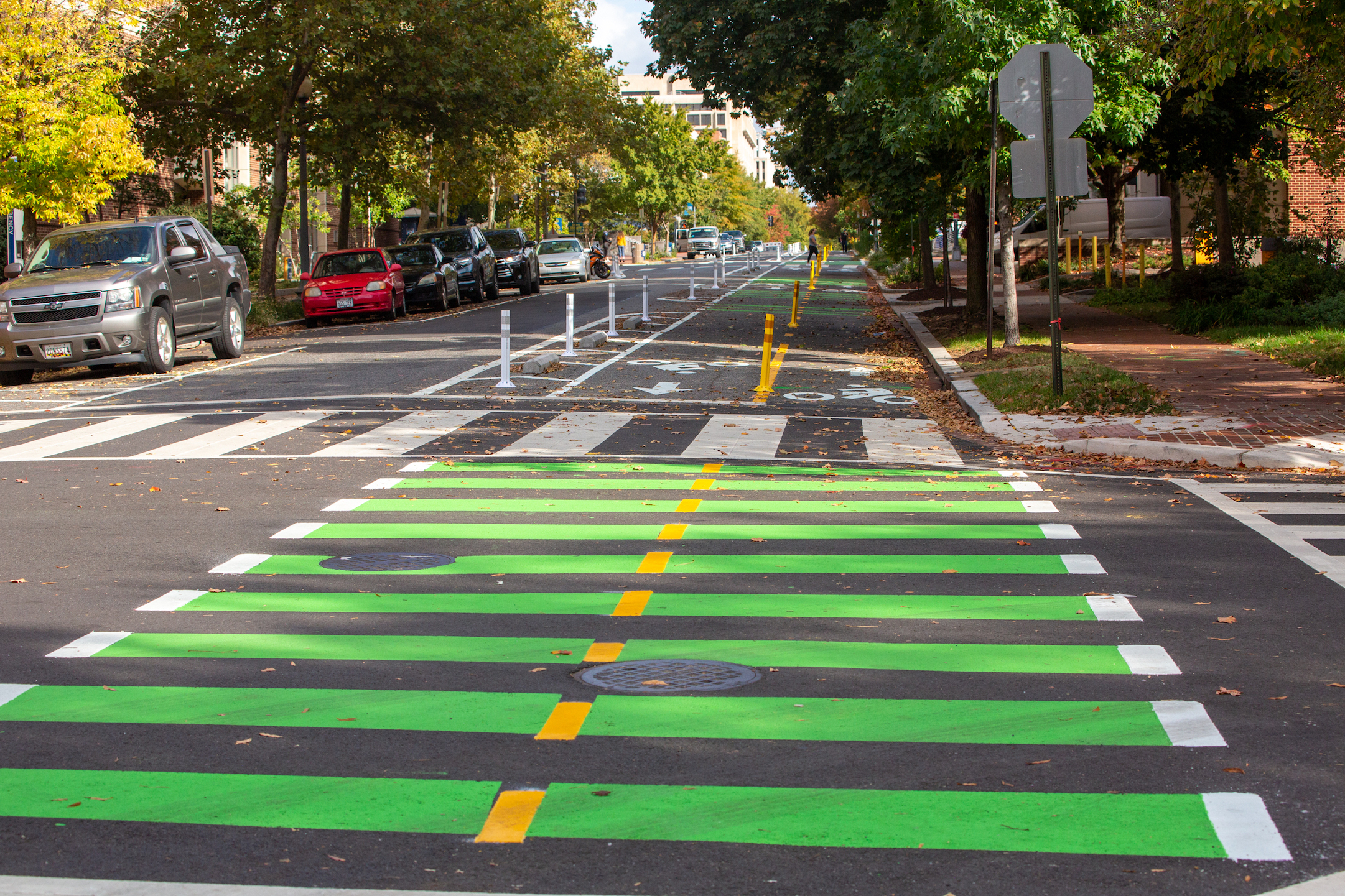
On top of that, bike infrastructure in DC has improved significantly in the last few years. I’d specifically call out the 9th and 15th Street bike lanes as some of my favorite in the city, as they’re two-way and generally free of cars.
The 15th St bike lane is exactly the type of bike infrastructure I’d love to see built throughout the city.
Conclusion
DC definitely isn’t perfect in terms of walkability/transit/bike infrastructure. In November of 2023, DC’s traffic deaths hit a 16-year high which included 17 pedestrians and 2 cyclists. Additional bike infrastructure has faced staunch opposition from Connecticut Avenue NIMBYs, and the existing bike lanes sometimes take you to some odd, dangerous crossings or force you into traffic.
That being said, I’ve been loving going what I’ll call “car-lite,” and I’m hoping in the next year that I can go totally car-free!